 Buy in bundle
The most used classes and methods:
- JSDialog
- JSDialog.DialogDefinition
- JSDialog.DialogInstance
- JSDialog.ButtonDefinition
- JSDialog.ButtonInstance
- JSDialog.Config
- JSDialog.Lang
JSDialog class
This is the mail class of the library. It is used for showing messages, configrmation dialogs and creating custom windows.
JSDialog.instances: Array of JSDialog.DialogInstanceThis array contains a list of created dialogs and can be used in debugging purposes. Do not change it manually.
text are optional.
Example of use:JSDialog.showMessageDialog("Hello, World!");JSDialog.showMessageDialog(
"This was a big mistake",
"error",
function() { console.log('Closed'); }
);
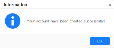 See more samples and demos of message dialog usage.
text: StringDefault value: no (required)
The text message for the dialog. Please specify plain text here. All HTML tags will be encoded. Use standard line delimiter
\n to specify multiline message.type: StringDefault value:
"info"Available values:
"info", "warning", "error", "confirm", "none", or any custom URLThe type of the message. This parameter affects to the icon displayed in the dialog and its default title. If
none value is set then "Information" title will be used by default.
If this value contains an URL it will be used to display custom icon placed on this URL (with "Information" title by default). We recommend you to use 64x64px icons.func: function()Default value:
nullThe function which is called on the dialog is closed.
width: IntegerDefault value:
450The width for the new dialog in pixels. This is the width of content area only, the borders depends of the used skin and will be added to this width automatically.
height: IntegerDefault value:
84The height for the new dialog in pixels. This is the height of content area only, the borders and height of title and buttons depends of the used skin and will be added to this height automatically.
title: StringDefault value: depends of
typeBy default the title is got by
type value. This option lets you set your own title.buttonTitle: StringDefault value:
"OK"Set this option to override default button name.
JSDialog.showConfirmDialog(
    "Do you want to continue?",
    function(result) {
        if (result == 'ok')
            console.log("User confirmes the operation");
    }
);JSDialog.showConfirmDialog(
"Are you sure?\nAll unsaved changes will be lost",
function(result) {
if (result == 'ok')
console.log("Yes pressed");
},
"warning",
"yes:Yes, sure!|no|abort"
);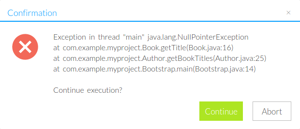 See more samples and demos of confirmation dialog usage.
text: StringThe text message for the dialog. Please specify plain text here. All HTML tags will be encoded. Use standard line delimiter
\n to specify multiline message.type: StringDefault value:
"info"Available values:
"info", "warning", "error", "confirm", "none", or any custom URLThe type of the message. This parameter affects to the icon displayed in the dialog and its default title. If
none value is set then "Information" title will be used by default.
If this value contains an URL it will be used to display custom icon placed on this URL (with "Information" title by default). We recommend you to use 64x64px icons.buttons: StringDefault value:
"ok|cancel"Definition of buttons set and (optionally) their titles. Format:
button1[:title1]|button2[:title2]...
You can do not set titles in this case default titles for specifiend buttons will be used.
The list of buttons available:
yes (synonyms with other titles: ok, confirm, accept
no (synonyms with other titles: decline)
cancel (synonyms with other titles: abort)
Note that using synonyms of the buttons will not affect to return result in the function func passed as the handler.width: IntegerDefault value:
450The width for the new dialog in pixels. This is the width of content area only, the borders depends of the used skin and will be added to this width automatically.
height: IntegerDefault value:
84The height for the new dialog in pixels. This is the height of content area only, the borders and height of title and buttons depends of the used skin and will be added to this height automatically.
title: StringDefault value: depends of
typeBy default the title is got by
type value. This option lets you set your own title.Please use it to create any dialogs except message and confirmation dialogs.
parameters is associative array containing all options for new dialog.Sample usage:
JSDialog.create(
    {
        elementId: 'btnId',
        title: 'My custom dialog',
        contents: '<p>My custom text</p>',
        onOk: function() { console.log('OK'); }
    }
);
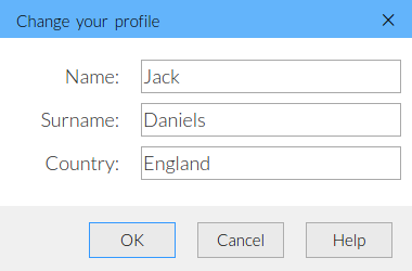 See more samples and demos of custom dialog usage.
JSDialog.DialogDefinition class
This is associative array to pass inside JSDialog.create function. See its sample usage to see how you can set this array.
Full list of parameters keys:
element: DOM elementDefault value:
null(optional) Element on the page dialog is to be called by pressing on. Use this parameter to specify a button element which calls your dialog (on
onclick event).elementId: StringDefault value:
null(optional) ID of the element which will call the dialog on the
onclick event. The save as element parameter but DOM element will be found by ID not by direct linking to it.
APIelementClass: StringDefault value:
null(optional) The same like
elementId but the search is made by class name. The first found element with specified class will open the dialog on its onclick event.title: StringDefault value:
""The title for new dialog
width: IntegerDefault value:
400The width for the new dialog in pixels. This is the width of content area only, the borders depends of the used skin and will be added to this width automatically.
height: IntegerDefault value:
300The height for the new dialog in pixels. This is the height of content area only, the borders and height of title and buttons depends of the used skin and will be added to this height automatically.
autoCenter: BooleanDefault value:
trueAvailable values:
true, falsefalse will disable dialog centering on show and on size change eventscontents: StringDefault value:
""HTML contents of the dialog
buttons: Array of definitions for JSDialog.ButtonDefinitionDefault value:
[]The array of parameters for creating Buttons. All buttons will be created in the same order they are placed into array.
hasCloseBtn: BooleanDefault value:
trueAvailable values:
true, falseThe close button is "x" button in the title of the dialog.
onCancel event is attached to this button. Set this option to false to hide it.onShow: function(JSDialog.DialogInstance)Default value:
nullThis event handler is called on each dialog show.
onFirstShow: function(JSDialog.DialogInstance)Default value:
nullUse this event handler to apply some changes to the dialog on first show.
onHide: function(JSDialog.DialogInstance)Default value:
nullCalled each time the dialog is being hidded, regardless of what button (OK, Cancel, etc.) was the initiator of dialog closing. This function is called after possible
onOk or onCancel call.onCancel: function(JSDialog.DialogInstance)Default value:
nullCalled before dialog is to be closed by clicking "Cancel" button or "x" button in the title. This function must return
true to allow closing the dialog or false to disallow it.
If this hook is not defined, dialog assumes that closing is always allowed without any conditions.onOk: function(JSDialog.DialogInstance)Default value:
nullCalled before dialog is to be closed by clicking "OK" button.
JSDialog.DialogInstance class
This is the class for all runtime-generated dialogs. When you create any dialog object you get this class instance as result. Use is to manipulate created dialog.
elDlg: DOM elementThe link to DOM element with root element for current dialog
elContent: DOM elementAn element which is used to store all dialog contents. This element is inside
elDlg element.elBg: DOM elementAn element for background of the dialog placed outside
elDlg element. Note that this element may be null if background feature is disabled by your configuration.JSDialog.instances array.getButton function returning "OK" button.getButton function returning "Cancel" button.getButton function returning "x" button (close button in the title of the dialog).JSDialog.Config.JSDialog.ButtonDefinition
This is the associative array for defining the button inside JSDialog.create function.
It has these parameters:
name: StringOptional for accessing the button
type: StringDefault value:
"custom"Available values:
"ok", "cancel", "custom"The type of the button. OK and Cancel buttons will try to close dialog on click (they will call
onOk and onCancel functions). Custom buttons do not have any default behaviour.title: StringDefault value: Depends of
typeThe title for the button. If you use "ok" or "cancel" type for this button you may not define this value.
func: function(dlg: JSDialog.DialogInstance)Default value:
nullOptional onClick handler. For OK and Cancel buttons dialog will be closed if this function returns
trueenabled: booleanDefault value:
trueAvailable values:
true, falseDefault enabled state for the button
JSDialog.ButtonInstance class
The class representing button object on a dialog.
You do not need to create this object manually, but you may need to know its API for changing buttons in runtime. For example you can call this code to disable your "OK" button::
dlgInstance.getOkButton().setEnabled(false);JSDialog.Config class
This global class is used to preconfigure the JSDialog. Use it before creating any dialogs to set visual theme, change CSS and HTML templates of the dialogs.
loadSkin method.JSDialog.Config.skin: StringDefault value:
defaultThe skin (visual) for all dialogs. See root folder of JSDialog to see the list of available skins (including the custom ones if you have created them).
JSDialog.Config.zIndexStart: integerDefault value:
11010Starting zIndex for placing dialogs into the document. Change this value if elements of your web application are higher than default zIndex of JSDialog.
JSDialog.Config.templateDialog: String (HTML)To redefine dialogs visual style use padding another HTML template into this parameter before creading any of dialogs. By default JSDialog uses this template (change it as you want):
<div class="jsdialog_dlg">
    <div class="jsdialog_title">
        <div class="jsdialog_title_text"></div>
        <div class="jsdialog_x">×</div>
    </div>
    <div class="jsdialog_content_wrap">
        <div class="jsdialog_content"></div>
    </div>
    <div class="jsdialog_buttons"></div>
</div>JSDialog.Config.templateButton: String (HTML)If you are creating a new skin, you might wand to set and buttons template to. By default the button is simple tag "a" styled with CSS only, you can change it. The only to remember is that JSDialog will use exactly root tag of buttons to insert styles and text content inside it. By default it's equals:
<a></a>JSDialog.Config.templateBg: String (HTML)The template for rendering background of the dialog. In ohter words it is the tag which by default is displayed behind the dialog and shadows currently inactive document. Without this tag (even with a little opacity) all elements behind the dialog will be available to interact with. Default code for it:
<div class="jsdialog_bg"></div>JSDialog.Config.contentBorders: Array[top, right, bottom, left, buttonsHeight]Default value:
[45, 10, 10, 10, 60]The array with 5 integer elements which define width and heigth of borders of dialogs and the height of buttons panel. This values are needed in dynamic way so there is no possibility to set them in CSS only. Please specify this value if you are creating another skin with different to default borders.
JSDialog.Config.css: String (URL)Default value: Depends to
JSDialog.skinNo default CSS will be used if you set custom URL for this option. By default JSDialog loads
skin/jsdialog.css from its root folder.JSDialog.Config.useCss: BooleanDefault value:
trueAvailable values:
true, falseIf you change this value to
false no default skin-related CSS will be embedded to the document at all.
Be sure that you include it in the document in other way instead of default mechanism.JSDialog.Lang class
This class contains all string used by JSDialog. Use it to localize JSDialog library to other language. Localizing must be done before any dialogs are created. For example:
JSDialog.Lang = {
    ok: "OK",
    yes: "Да",
    confirm: "Подтвердить",
    ...
};
The list of keys in JSDialog.Lang object:
ok | "OK" |
yes | "Yes" |
confirm | "Confirm" |
accept | "Accept" |
no | "No" |
decline | "Decline" |
cancel | "Cancel" |
abort | "Abort" |
information | "Information" |
warning | "Warning" |
error | "Error" |
confirmation | "Confirmation" |